Magento is a powerful ecommerce platform, but power alone does not create revenue. Growth depends on how easily customers can find products, understand value, trust the store, and complete a purchase without hesitation. A well-designed Magento experience combines performance, clarity, accessibility, and conversion strategy into a storefront that feels reliable from the first click to the final order confirmation.
TLDR: Magento ecommerce web design should focus on speed, intuitive navigation, mobile usability, trust signals, and a streamlined checkout. Every design decision should reduce friction and help customers move confidently toward purchase. The best results come from combining strong UX principles with Magento’s technical flexibility, including optimized themes, clean product pages, and data-driven improvements.
Design for Speed Before Decoration
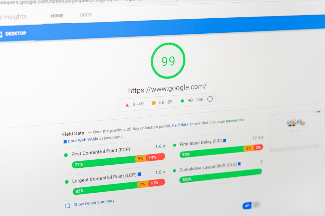
Speed is one of the strongest UX factors in ecommerce. If a Magento store loads slowly, customers often leave before they see the product offer. Slow pages also weaken organic search visibility and reduce the effectiveness of paid traffic. For a serious ecommerce business, performance must be treated as part of design, not as a technical detail to fix later.
Start with a lightweight, well-coded theme. Avoid unnecessary sliders, excessive animations, oversized images, and third-party scripts that do not directly support the buying journey. Use modern image formats, lazy loading, caching, and a content delivery network where appropriate. Magento stores should also be reviewed regularly for extensions that add weight without measurable value.
Best practice: measure load times on real product, category, cart, and checkout pages. A homepage that feels fast is not enough if shoppers experience delays during the most important conversion steps.

Create Navigation That Matches Buyer Intent
Good navigation is not simply a menu with many options. It is a structure that reflects how customers think about products. Magento stores often carry large catalogs, so category architecture must be clear, predictable, and easy to scan.
Use descriptive category names, logical subcategories, and on-page filters that help customers narrow choices quickly. Filters should be relevant to the product type. For example, apparel shoppers may need size, color, fit, and material, while electronics buyers may need compatibility, capacity, power, and brand. Poor filtering forces customers to work too hard and increases abandonment.
- Keep primary navigation concise: highlight the most important categories instead of listing everything.
- Use search prominently: many high-intent shoppers prefer to search directly.
- Support typo tolerance and synonyms: customers may not use internal product terminology.
- Show breadcrumbs: they help users understand where they are and move back easily.
For Magento ecommerce web design, navigation should be validated with analytics. If users rely heavily on search, review whether category paths are unclear. If certain filters are rarely used, simplify them. UX improves when design decisions are based on observed behavior, not assumptions.
Build Product Pages That Answer Real Questions
The product page is where uncertainty must be removed. Customers need to know what the product is, whether it fits their needs, what makes it valuable, and whether buying from your store is safe. A strong product page combines persuasive content with practical detail.
Use high-quality images from multiple angles, zoom features, clear product titles, accurate specifications, availability status, delivery information, return details, and visible price information. Product descriptions should be written for buyers, not only for search engines. They should explain benefits, use cases, materials, compatibility, sizing, and care instructions where relevant.
Trust is built through completeness. Missing information creates hesitation, and hesitation often becomes abandonment. Include customer reviews, ratings, warranty information, secure payment icons, and support options close to the buying decision area. If products are complex, consider comparison tables or FAQ blocks directly on the product page.
Prioritize Mobile UX Without Compromise
Most ecommerce browsing now happens on mobile devices, even when final purchases sometimes occur on desktop. A Magento store must be designed mobile-first, not merely made responsive after the desktop version is complete.
Mobile UX requires large tap targets, readable typography, simplified headers, sticky add-to-cart buttons, fast-loading images, and forms that are easy to complete with a thumb. Avoid intrusive popups that cover the screen or interrupt browsing too early. If promotions are important, use restrained banners or timed offers that do not block product discovery.
Mobile checkout deserves particular attention. Customers should not have to pinch, zoom, or repeatedly correct formatting errors. Use appropriate input types for email, phone, address, and payment fields. Offer guest checkout and make account creation optional after purchase. Every additional step should justify its existence.
Simplify Checkout to Protect Revenue
Checkout is where UX directly affects revenue. A customer who reaches checkout has already shown purchase intent, so the goal is to remove anything that introduces confusion, doubt, or delay.
Magento checkout should be clean, focused, and transparent. Show the order summary clearly, including taxes, shipping costs, discounts, and estimated delivery. Unexpected costs late in checkout are a major cause of cart abandonment. If shipping fees vary, provide estimates earlier on the cart or product page.
- Allow guest checkout: forced registration creates unnecessary resistance.
- Minimize required fields: collect only what is necessary to complete and fulfill the order.
- Display progress clearly: users should know how many steps remain.
- Support multiple payment options: include trusted methods suitable for your market.
- Preserve cart contents: customers should not lose their work if they return later.
Security messaging should be visible but not overwhelming. A serious store reassures customers with SSL indicators, trusted payment logos, clear privacy language, and accessible support, while keeping the checkout page distraction-free.
Use Visual Hierarchy to Guide Decisions
Effective ecommerce design guides the eye. Important actions such as “Add to Cart,” “Proceed to Checkout,” and “Apply Coupon” should be visually distinct and placed where users expect them. Secondary actions should not compete with primary conversion goals.
Use consistent spacing, strong headings, readable body text, and clear contrast. Avoid cluttered sections where promotional banners, recommendations, reviews, and technical details all compete equally. On category pages, product cards should present the most decision-relevant information first: image, name, price, rating, promotion, and availability.
Consistency is essential. Buttons, colors, labels, icons, and form behavior should work the same way across the store. Inconsistent interactions make the site feel less professional and increase cognitive effort.

Design for Trust, Accessibility, and Long-Term Growth
Trustworthy design is not only about appearance. It includes accessibility, transparency, and reliability. Magento stores should be usable by people with different devices, abilities, and browsing conditions. Use sufficient color contrast, meaningful alt text, keyboard-friendly navigation, clear error messages, and labels for form fields. Accessibility improvements often benefit all customers, not only those with specific needs.
Trust also depends on operational clarity. Make shipping policies, returns, contact information, privacy terms, and customer service options easy to find. If your business offers guarantees, certifications, or expert support, present them in a credible and specific way. Avoid vague claims that cannot be verified.
For growth, UX should be continuously tested. Review analytics, heatmaps, search queries, cart abandonment data, and customer support questions. Run controlled A/B tests on key pages, but test meaningful changes rather than superficial color variations. Magento’s flexibility allows businesses to adapt layout, merchandising, promotions, and checkout flows as evidence emerges.
Conclusion
Magento ecommerce web design is most effective when it serves the customer’s decision-making process. A successful store loads quickly, helps users find the right products, explains value clearly, works smoothly on mobile, and makes checkout feel safe and simple. These best practices are not cosmetic improvements; they are commercial fundamentals.
Faster growth and higher conversions come from reducing friction at every stage of the journey. When Magento’s technical capabilities are paired with disciplined UX design, the result is a storefront that customers can trust, navigate, and buy from with confidence.