Time charting has become an essential practice for organizations, analysts, project managers, educators, healthcare teams, researchers, and individuals who need to understand how events, work, resources, or behaviors change over time. A time chart presents information along a time-based axis, making it easier to recognize patterns, compare performance, monitor progress, and identify delays or opportunities. Whether it is used to track a product launch, employee schedules, financial trends, patient recovery, or historical events, time charting turns raw chronological data into a visual story that can be understood quickly.
TLDR: Time charting methods help people visualize activities, events, trends, and performance across a timeline. Common approaches include line charts, Gantt charts, timelines, area charts, heat maps, and milestone charts. These methods are used in project management, business reporting, healthcare, education, finance, operations, and personal productivity. The best time chart depends on whether the user needs to show sequence, duration, comparison, workload, or change over time.
What Is Time Charting?
Time charting is the process of organizing and displaying data according to time. Instead of presenting information only in tables or written reports, time charts place data points, tasks, events, or measurements along a chronological structure. This allows viewers to see when something happened, how long it lasted, how often it occurred, and how it changed.
In most time charts, the horizontal axis represents time, while the vertical axis represents values, categories, tasks, or resources. However, the structure can vary depending on the method. Some charts show continuous change, while others show discrete events, scheduled work, phases, or milestones. The main purpose is to make temporal relationships visible.

Why Time Charting Matters
Time-based information can be difficult to interpret when it is stored in spreadsheets, logs, or long written records. A viewer may struggle to understand whether progress is accelerating, deadlines are realistic, or incidents are becoming more frequent. Time charting solves this problem by creating a visual map of chronology.
Organizations use time charts because they support faster decision-making. A project manager can immediately see which task is behind schedule. A sales leader can compare monthly revenue trends. A hospital administrator can monitor patient intake patterns across shifts. A teacher can show students how historical events are connected. In each case, the chart makes time-related information easier to interpret.
Time charting also improves communication. Teams with different roles may not interpret raw data in the same way, but they can usually understand a clear visual timeline. This makes time charts useful in meetings, dashboards, reports, presentations, and planning documents.
Common Time Charting Methods
1. Line Charts
A line chart is one of the most widely used time charting methods. It connects data points with a continuous line, usually showing how a value changes over minutes, days, months, quarters, or years. Line charts are especially useful when the goal is to show trends.
For example, a company may use a line chart to display monthly sales revenue over three years. A healthcare researcher may use one to show changes in blood pressure over a treatment period. A website manager may track daily visitors to identify traffic spikes or drops.
Best use cases for line charts include:
- Tracking revenue, expenses, or profit over time
- Monitoring website traffic or app usage
- Measuring temperature, speed, or other scientific data
- Showing long-term growth or decline
- Comparing multiple time-based trends on the same chart
2. Bar Charts Over Time
A time-based bar chart uses bars to represent values during specific time periods. Unlike line charts, which emphasize continuous movement, bar charts make it easier to compare individual time intervals. Each bar may represent a day, week, month, quarter, or year.
This method is useful when data is grouped into periods. For instance, a retailer may compare weekly sales totals, or a factory may compare monthly production output. Bar charts are often clearer than line charts when the user wants to compare separate categories across time.
3. Gantt Charts
A Gantt chart is a time charting method used to show project schedules. It displays tasks as horizontal bars across a timeline. The length of each bar represents the task duration, while its position shows the start and end dates. Gantt charts can also show dependencies, milestones, deadlines, and task ownership.
This method is especially popular in construction, software development, product launches, marketing campaigns, event planning, and operations management. It helps teams understand what needs to happen, when it should happen, and which tasks overlap.
A Gantt chart is particularly helpful when a project includes:
- Multiple tasks with different durations
- Dependencies between tasks
- Several departments or team members
- Strict deadlines or delivery dates
- Parallel workstreams that must be coordinated
4. Timelines
A timeline presents events in chronological order. It may be simple and linear, or it may include branches, categories, images, annotations, and milestones. Timelines are often used to show history, development, strategy, or progress.
For example, an organization may create a timeline of its company history, from founding to major product releases. A legal team may build a timeline of case events. A teacher may use a timeline to explain political movements, scientific discoveries, or literary periods.
Timelines are best when the main goal is to show sequence rather than precise numerical measurement. They help viewers understand causality, progression, and context.
5. Milestone Charts
A milestone chart highlights key dates or achievements rather than every detail of a process. It is usually simpler than a Gantt chart and focuses on major checkpoints. These charts are often used in executive presentations because they communicate progress without overwhelming the audience.
Milestone charts are useful for product roadmaps, strategic planning, funding schedules, compliance deadlines, and event preparation. They answer questions such as: What major events are coming next? Has the team reached the most important targets? Are key dates still realistic?
6. Area Charts
An area chart is similar to a line chart, but the area below the line is filled with color. This emphasizes volume, magnitude, or cumulative totals over time. Stacked area charts can also show how different categories contribute to a total.
For example, a streaming platform may use a stacked area chart to show viewing hours by device type over several months. A finance team may use one to show how different revenue streams contribute to total income. Area charts are visually powerful, but they should be used carefully because overlapping or stacked areas can become difficult to read if too many categories are included.
7. Heat Maps by Time
A time-based heat map uses color intensity to show activity, frequency, or value across time intervals. It is commonly arranged by hour, day, week, or month. Darker or brighter colors usually indicate higher values, while lighter colors indicate lower values.
Heat maps are helpful when patterns repeat across cycles. A call center may use a heat map to identify the busiest hours of the week. A restaurant may use one to understand peak dining times. A cybersecurity team may use a heat map to spot suspicious login activity by hour and day.
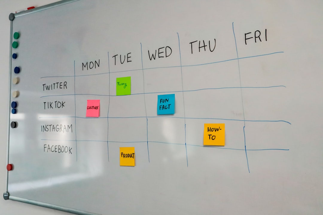
8. Calendar Charts
A calendar chart displays data directly on a calendar layout. Each day, week, or month can be colored or labeled according to activity, completion, mood, sales, attendance, or other values. This method is highly intuitive because it matches the way people already think about dates.
Calendar charts are commonly used for habit tracking, content planning, editorial schedules, workforce attendance, fitness tracking, and campaign planning. They make it easy to identify gaps, streaks, busy periods, and seasonal patterns.
Key Use Cases for Time Charting
Project Management
Project managers rely heavily on time charts to plan, coordinate, and monitor work. Gantt charts, milestone charts, and timelines help teams understand schedules, dependencies, risks, and progress. Without visual scheduling, complex projects can become difficult to manage because tasks may overlap, deadlines may be missed, and responsibility may become unclear.
In project management, time charting supports resource allocation as well. If several tasks require the same person or equipment at the same time, a chart can reveal the conflict early enough for managers to adjust the plan.
Business Performance Reporting
Businesses use time charts to track sales, costs, customer behavior, inventory, market trends, and operational performance. A line chart may show quarterly revenue growth, while a bar chart may compare monthly expenses. A heat map may identify peak customer support periods.
Time charting makes business reporting more actionable. Instead of simply stating that revenue increased, a chart can show when the increase began, whether it was steady or sudden, and whether it aligns with campaigns, seasonality, or market changes.
Healthcare and Patient Monitoring
Healthcare professionals use time charts to monitor symptoms, treatments, vital signs, medication schedules, and patient outcomes. A patient’s temperature or blood pressure may be tracked over time to determine whether treatment is working. Hospitals may chart admission rates by hour or day to improve staffing.
Time charting is valuable in healthcare because timing can affect diagnosis and care quality. It helps medical teams observe patterns that might not be obvious in isolated measurements.
Education and Learning
In education, time charts help explain historical events, scientific processes, student progress, and course schedules. Teachers may use timelines to show how events relate to one another. Administrators may use charts to track attendance or academic performance over semesters.
Students also benefit from time charting when planning assignments, studying for exams, or managing long-term projects. A clear visual schedule can reduce confusion and encourage better time management.
Finance and Investment Analysis
Finance professionals use time charts to study stock prices, interest rates, inflation, cash flow, and investment performance. Line charts and candlestick charts are common in financial analysis because they help reveal volatility, momentum, and long-term trends.
Time charting allows analysts to compare performance across different periods and understand the impact of economic events. It also helps investors evaluate whether a decision is based on short-term movement or long-term behavior.
Personal Productivity
Individuals use time charts to manage habits, goals, routines, and workloads. Calendar charts can track exercise, sleep, reading, or meditation. Personal timelines can help plan career goals or major life events. Time-blocking charts can show how hours are spent during the day.
By visualizing time, a person can better understand whether priorities match actual behavior. This makes time charting a useful tool for improving focus, reducing procrastination, and balancing responsibilities.
Choosing the Right Time Charting Method
The best chart depends on the question being asked. If the goal is to show continuous change, a line chart is usually appropriate. If the goal is to compare values across time periods, a bar chart may be better. If a user needs to manage tasks and deadlines, a Gantt chart is more suitable. If the purpose is to show important events in order, a timeline or milestone chart may work best.
Before choosing a method, the chart creator should consider:
- Purpose: Is the chart meant to explain, compare, monitor, or plan?
- Audience: Will viewers need a simple overview or detailed analysis?
- Time scale: Does the data cover minutes, days, months, or years?
- Data type: Is the information numerical, categorical, scheduled, or event-based?
- Complexity: How much information can be shown without reducing clarity?
Best Practices for Effective Time Charts
Effective time charts are clear, accurate, and relevant. They should avoid unnecessary decoration and focus on the message. Time intervals should be consistent unless there is a specific reason to vary them. Labels should be readable, and colors should be used with purpose.
It is also important to avoid overcrowding. Too many lines, bars, events, or categories can make a chart difficult to interpret. When the data is complex, it may be better to create multiple focused charts rather than one overloaded visual.
Finally, context matters. A chart should include enough information for viewers to understand what they are seeing. Titles, labels, legends, notes, and annotations can help explain unusual spikes, missing data, deadlines, or major events.
FAQ
What is the main purpose of time charting?
The main purpose of time charting is to visualize information in relation to time. It helps viewers understand trends, sequences, durations, deadlines, patterns, and changes.
What is the difference between a timeline and a Gantt chart?
A timeline shows events in chronological order, while a Gantt chart shows tasks, durations, schedules, and dependencies. Timelines are usually better for storytelling, while Gantt charts are better for project planning.
Which time chart is best for tracking trends?
A line chart is usually best for tracking trends because it clearly shows how values rise, fall, or remain stable over time.
When should a heat map be used?
A heat map should be used when the goal is to show intensity, frequency, or activity patterns across repeated time intervals, such as hours of the day or days of the week.
Can time charts be used for personal planning?
Yes. Individuals can use calendar charts, timelines, habit trackers, and time-blocking charts to manage routines, goals, study schedules, fitness plans, and productivity.
What makes a time chart effective?
An effective time chart has a clear purpose, readable labels, appropriate scale, consistent intervals, and a design that supports understanding without unnecessary clutter.