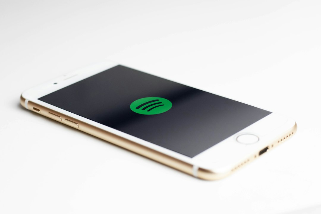
Spotify’s new logo is less of a dramatic redesign and more of a careful cleanup. The green circle, black sound waves, and simple wordmark are still there, but the brand now feels sharper, tighter, and more consistent across phones, web players, ads, and social posts. The biggest recent shift sits around Spotify’s broader visual identity, including its custom typeface, Spotify Mix, introduced by the company in 2024 [source: Spotify].
TLDR: Spotify has not thrown away its famous green logo. Instead, it has refined the design so it looks cleaner at small sizes and stronger in brand campaigns. For example, on a 32 px app icon, the simplified circle and sound-wave mark stay readable without needing extra detail. This is the kind of update most users barely notice, but designers spot it in about two seconds.

What actually changed?
The short answer: not as much as some people think. Spotify knows its logo is already highly recognizable. A full redesign would be risky. So the company has kept the core symbol and improved the system around it.
The logo still uses three curved lines inside a circle. Those lines suggest sound, streaming, signal, and movement. They are simple enough to work almost anywhere. That is the whole point.
The changes are more about polish:
- A cleaner visual system that makes the logo feel more controlled.
- Stronger typography through Spotify Mix and related brand text styles.
- Better spacing around the icon and wordmark.
- More consistent color use across digital screens and marketing.
- Improved readability at tiny sizes, such as favicons and app shortcuts.
The icon stays familiar
Spotify’s icon is still the hero. That green circle does a lot of work. You can spot it from across a room, even when the word “Spotify” is missing. That kind of recognition is hard to buy.
So, no, the company was never likely to replace it with some abstract shape that needs five paragraphs of explanation. Good. Honestly, it feels like many tech brands overthink redesigns and end up with something colder. Spotify has avoided that trap.
The three black curves remain slightly playful. They are not perfectly stiff. That small irregular feel has always helped Spotify seem human, not corporate in the dull sense.
The wordmark feels more refined
The bigger design story is the type. Spotify’s new brand type direction gives the wordmark and surrounding text a more custom feel. It is still simple. It is still readable. But it has more personality than a plain off-the-shelf font.
Spotify Mix has rounded parts, sharp cuts, and small details that make text feel both friendly and precise. That matters because Spotify is no longer just a music app. It is also podcasts, audiobooks, video clips, creator tools, playlists, charts, and ads. The brand has to stretch across all of that without looking messy.
The green is doing heavy lifting
Spotify green is one of the most useful parts of the brand. It is loud, but not childish. It works on black, white, and photo backgrounds. It also screams “Spotify” before a user reads a single letter.
The current look leans into that. The green is used with more confidence, often paired with deep black for strong contrast. This makes buttons, icons, playlist covers, and ads feel connected. It also helps the logo stand out on crowded home screens.
The catch is that bright green can get harsh if used badly. Put too much of it on one screen and it starts to feel like a warning label. Spotify usually avoids this by giving the green space to breathe.
What has not changed?
The most important parts remain intact. That is not laziness. It is smart brand management.
- The circle is still there. It keeps the app icon simple and memorable.
- The three sound waves are still there. They connect the mark to audio right away.
- The green and black pairing remains central. It keeps the logo instantly recognizable.
- The tone is still casual. Spotify has not turned into a luxury bank logo, thankfully.
Why make such a subtle update?
Because Spotify does not need a new identity. It needs a stronger one. There is a big difference.
Today, the logo appears in hundreds of places: lock screens, smart TVs, car dashboards, podcast thumbnails, social videos, wearable devices, and web embeds. A logo that looks fine on a phone may look weak on a billboard. A wordmark that looks good in an app header may feel bland in a global campaign.
Small design fixes solve those problems. Tighter spacing improves balance. Cleaner type improves trust. Better contrast improves speed. Users may not say, “Wow, the kerning is nicer.” But they do feel the brand is easier to read.
Image not found in postmeta
Why the redesign feels familiar
The best logo updates often feel a bit invisible. They keep the memory of the old mark while making it work harder. Spotify’s update follows that logic.
If the old logo felt like a startup with a great music app, the newer brand system feels like a global audio platform. It is cleaner. It is more flexible. It is less random. Yet it still has that casual Spotify energy.
That balance is the real change. The logo has not been reinvented. It has been tuned, like a track before release. Same song. Better mix.